Anniversary Story | Jul 20, 2017
Evolution of the Brand
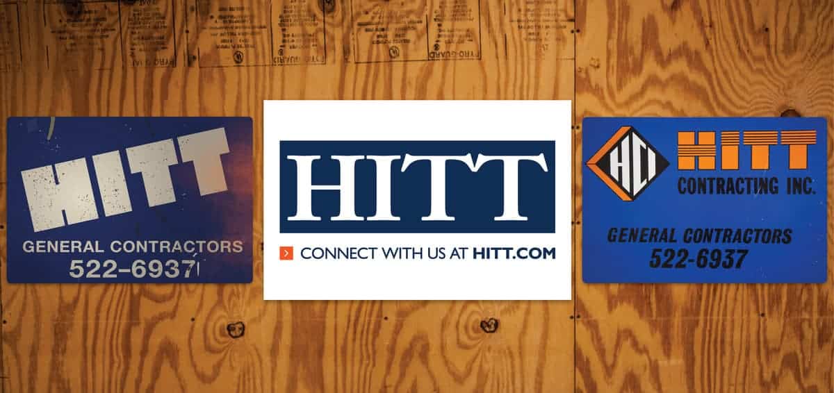
The bold blue and clean white of the simple HITT logo is the most visible graphic asset of our brand. To HITT team members, it conveys authenticity, consistency, reliability, and professionalism above all else. Whether displayed on our jobsite signage, emblazoned on the side of our vehicles, or worn proudly by team members, the logo bears deep meaning.
With 80 years of history, we’ve had a number of names, colors, and logos before our current brand look. From a paint and decorating company, to a commercial interiors firm, to a full-service national general contractor, our brand has evolved many times over.
Each iteration of the logo serves as a reminder of where we were as a company, and how far we have come since 1937. What began as a small business has grown to a nationally ranked firm, and our look has changed to keep pace with that evolution.
“Our logo is strong and clean,” said Co-Chairman Jim Millar. “The bold simplicity holds forth our brand promise of quality and service. It’s classic.” We believe that by putting our name on a trailer, a building, or a truck, there is an expectation of the experience to follow.
Our employees are brand ambassadors, and deliver this experience every day. The HITT brand is a promise to our partners, subcontractors, and clients that we will exceed their expectations, every time. As stated in our mission, “This is our legacy, the foundation for our growth, and the path to our future.”

